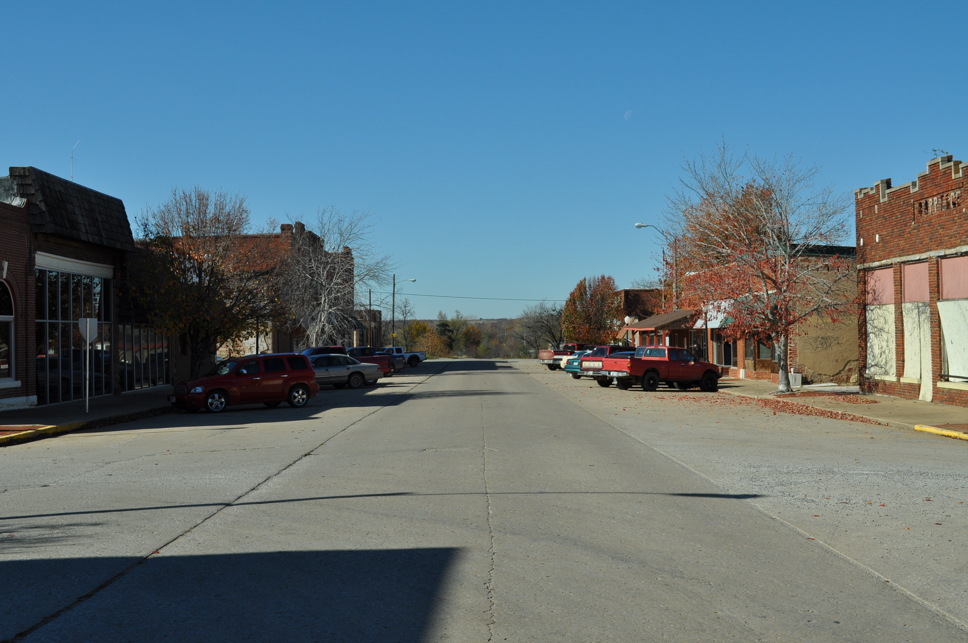
A while back, we told you about Meagan Vandecar, a student at OU Tulsa’s Urban Design Studio, and her project focusing on her town of Depew, Oklahoma. In mid-November, several IQC staff members met with Meagan and groups from the Tulsa Urban Design Studio and the Indian Nations Council of Governments. We spent two days getting to know the people and places of Depew and becoming familiar with its unique challenges by listening to what community members had to say. At the end, we had come up with a simple set of obtainable ideas to help Depew’s Main Street become a more attractive destination for residents and the thousands of Route 66 tourists who drive by each year.
Depew is an excellent example of a small, historic town on old Route 66. However, one of its problems is that the new Route 66 highway actually bypasses the original route which curved through Depew’s Main Street. As a result, very little of the tourist traffic is captured in Depew, and there are very few businesses on Main Street.
 Attracting tourists into Depew was one of the main design challenges we wanted to address. But we really wanted to consider how solving this design challenge can also improve the quality of life for the 500 residents of the town. On our first night, we held an open house for community members to come help us develop ideas and give input.
 The final solution involved a few major components. First, signage. Travelers on the new Route 66 highway must be directed to follow the old route through Depew’s Main Street. Second, a destination. If the town succeeds in getting travelers to turn, there must be a destination to keep them interested. And finally, iconic imagery. Icons, such as the beautiful old water tower, can create a sense of identity for the community and serve as beacons inviting people to come in.
For signage, four key turning points were identified, where signs must instruct travelers to turn. New street signs for Main Street would emphasize that it is the true Route 66. As a destination, we considered the unique solution of a play on the town’s name, which sounds almost like “The Pew.” We designed a traffic island at a central intersection which would include a pew in the middle of the street, and invite tourists (and locals) to “Come have a seat in Depew” for a simple photo opportunity. This requires no costly ongoing operations, but still provides a sense of satisfaction for anyone who passes through. Hopefully, it would cause traffic to build to a level consistent enough to support a new restaurant or shop. And for iconic imagery to reinforce the identity of Depew, a new paint job for the water tower and interesting banners proclaiming Depew’s identity for light poles. Blue and yellow, the local school district’s colors, were selected for banners. Black and white, the colors of the Route 66 logo, were used for the water tower and the pew. You can get a look at all the renderings and designs for Depew, Oklahoma in the presentation below.

Let’s make it happen!
Very Nice!! Lets go!!
Beautiful little town and surely a place that would be nice to visit or pass through. Not sure about the concept of “The Pew”, though. It seems a little too corny, and a lot of people may not get the logo immediately, if at all. Great start on the brainstorming, though.
I’m all about history and preserving our small towns….wish I could live on rt 66 and buy one of those old buildings.